◇ Case study
Standardized design language for consistency and accessibility

As a user, when accessing the secure portal, I want to see consistency across modules when it comes to style, patterns, and functionality.
Design System
UI
A11y
Responsive Web
Fondue Design System
Overview
Objectives
- Consistent styling across components
- Cross-browser and responsive support
- Responsive design: ensure all front-end components are displayed appropriately based on device type and breakpoints
- Strict accessibility/compliance (508 standards)
Consumers
Internal stakeholders:
- Designers
- Analytics partner
- Developers
Products
- Oklahoma Medicaid
- Next Gen Foster Care
- Legacy Portals through Interceptor
Problem Statements
Existing systems had evolved in silos, leading to inconsistent UI patterns, styling, browser behavior, and accessibility.
The initiative aimed to unify these into one coherent system for scalability and maintainability.
Design Language
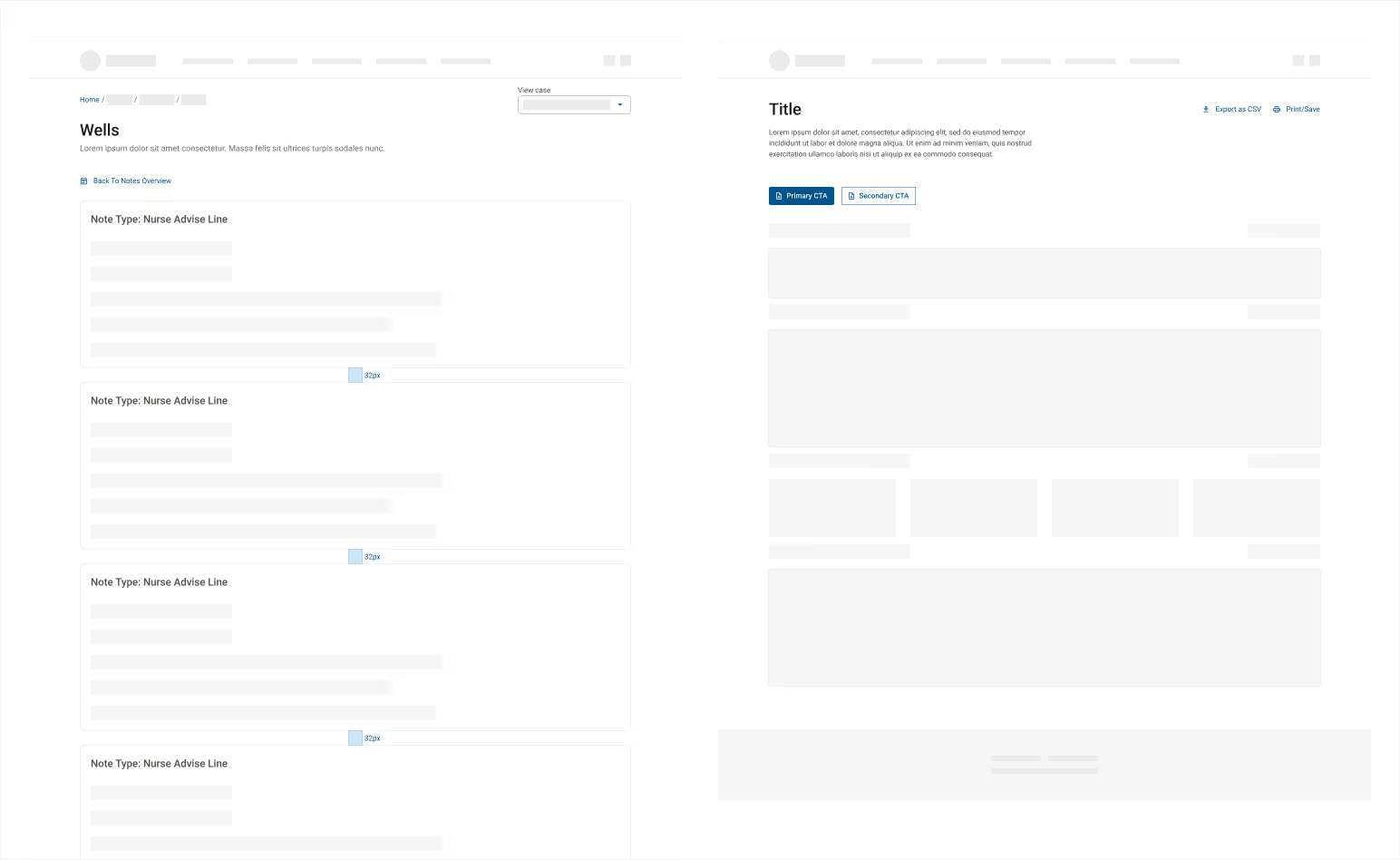
The team and I set forth a set of principles that acted as a living document accessible to all designers, developers, and product managers. It was divided into easy-to-navigate sections that provided detailed structure of commonly used components, along with best practices for implementation
Atomic Components
Interactions
Layout


Governance & Adoption
- A11y: all assets were approved by Accessibility team
- Weekly design audits to catch deviations
- Workshops and documentation to onboard teams
- The guidelines updated consistently, adapting to new feature needs
- Research validation on new patterns
Timeline
01
Audit
- Identify areas of inconsistencies or sub-par aesthetic
02
Design Principles
- Established a set of foundational princiles
- Accessibility, consistency, compatibility, and responsive
03
Standardize Components and Styles
- Developed the design language guideline
04
Implementations
- The guideline was made available as living document
05
Cross-team Collaboration
- Design support
- Workshops and training sessions
06
Maintenance
- Set up governance team for continuous updates and expansion
Outcomes
What's Strong
- Establishment of a shared visual and interaction language, enabling consistent UX across products
- Improved usability, accessibility, and visual coherence
- Faster development cycles, reduced design/development maintenance overhead
- A foundation that scales as the product portfolio grows
Areas for Enhancement
- Visuals & Screenshots: Adding UI examples (before/after, component library previews) would enrich visuals
- Quantifiable Metrics: Data on improved development time, reduced inconsistencies, or accessibility gains would boost impact
- Quotes or Feedback: Including user or team testimonials could humanize outcomes
